As more data begins to show up on the website (https://cafltar.org/data/) and with the reformatting of the Eddy Covariance Flux Tower Data dashboard, it behooves us to take a minute to explain the data being displayed and its potential usage from a researcher’s perspective. Today, the core meteorology data. The “research-grade” data and instruments will be presented in subsequent posts.
Basic Weather Data
Most of the meteorology data is self-explanatory, with most being familiar with basic meteorology variables (temperature, relative humidity, wind speed and direction from cup and vane, and precipitation from a rain gage, Figure 1) from weather reports on the TV, weather apps, newspapers, etc. I won’t go too deep in-depth for every measurement since they are familiar. As such, I will try to note some of the quirks of the data particular less familiar to daily public use. Most of what is presented on the dashboard are ubiquitous measurements and information regardless of your preferred source of weather information. All the measurements taken are automated and the data is stored at the site within the data logger/microcontroller and sent to our database in near-real time, hence the pretty dashboard displaying the data. Only one item of the dashboard is probably unfamiliar to most, hence I will spend an extra paragraph on it later in the post.
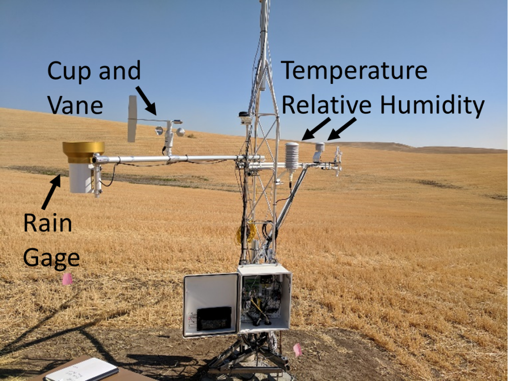
Figure 1
With that out of the way, let us start the tour! All our measurements are recorded in metric units (SI), as applicable, because all the equations we use for further analysis all assume metric units and is standard across scientific fields. On the dashboard, we converted some of the measurements from SI to Imperial for ease of use. Wind direction (degrees from North) and relative humidity (percentage) are the same regardless of measurement system. Pressure can be a little goofy since there are many different ways of reporting pressure depending the measurement and application. Here, we report pressure as millibars as is often seen on weather reports. Another relatively common atmospheric pressure measurement is in inches of Mercury but is less prevalent these days than in the past. Often, pressure is reported as mean sea level pressure, where the pressure is converted to an equivalent as if the measurement were taken at sea level, removing the influence of elevation for easier comparison. Due to limitation with our dashboard software, we could not easily make this conversion. Please note that here we report pressure as the measured atmospheric value but on most weather maps pressure is reported as mean sea level pressure.
The less common measurement we report on this dashboard is PAR, or Photosynthetically Active Radiation. PAR is the amount of light from the sun that is available for the crops to use for photosynthesis. The wavelengths measured for PAR are approximately the same as those of visible light (~400-700 nanometers) so, it is dependent on the general sunniness of any given day. The amount of PAR is important for relating the generally sunniness to overall plant growth because, as the name suggests, it is a driver of photosynthesis.
For most of the sites, there is a picture of the field the tower is in. In the our parlance, this is referred to as the “PhenoCam” because it sends its data directly to the PhenoCam Network. Yes, this means we literally watch our crops grow over the year. But we can also use it to see when the fields are covered with snow, the timing of different field operations (harvest, planting, etc.,), and every so often, an intrepid researcher taking field samples. PhenoCam is a portmanteau of Phenology and Camera. The camera part because…well…it is a camera and is there to monitor the phenology of the system. Phenology is defined generally as the seasonal or cyclic evolution of a natural system, in this context, the evolution of different crops in the context of climate and field management operations. Being a heavily managed system, the single-season phenology is generally well-known based on the crop and field management. But how individual field and crop phenology compares across multiple fields and years to other metrics and indices and to other agricultural systems is an interesting question and the basis of an on-going LTAR network project.
This is a very, very brief tour of the data dashboard. We are constantly collecting and calculating many hundreds of different variables and pieces of data from these towers every hour. Some are useful across many applications, such as the general weather data on the dashboards, and some are highly specific diagnostic variables used to monitor the health of the instruments in the field that are only used when there is a problem. There are plans for subsequent posts detailing some of the other major data products collected from the towers, such as the water and carbon fluxes, energy budget measurement, and in-soil measurements, but you will just have to wait on those.